Design Portfolio
Posters
DATE
PROF
COURSE
2023
CREW 431
JOY GUGELER
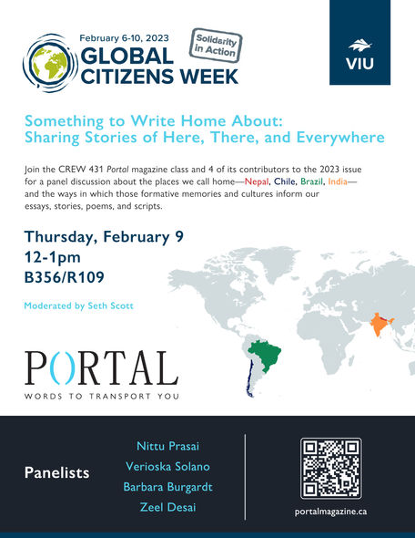
Global Citizens Week Panel
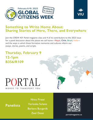
This poster went through several drafts. For the final version, I used the Portal website's accent colour to make the title and panelists pop; I liked this idea as it helps to subtly reinforce consistency as a brand, which is something I set out to do when I first joined the team.
DRAFTS
DATE
PROF
COURSE
2022
CREW 430
JOY GUGELER
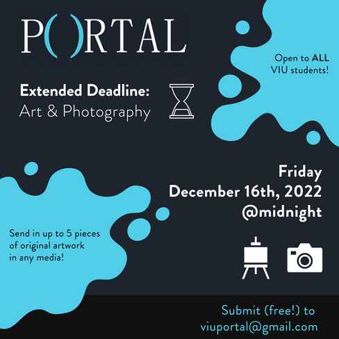
Art & Photography Submissions
This is the first poster I designed from (essentially) scratch. I followed the theme of the regular submissions poster, but used portrait orientation to help differentiate it. I employed artsy stock graphics to make the message visually clear at a glance, and I set up a sort of 'footer' area that could be cropped out for square social media posts (as information such as a URL becomes redundant with hyperlinks). I received positive feedback from the publisher, who approved this design upon first draft.
If I were creating this design now, I would have asked why the parentheses in the logo are sized up. It was the same way in the previous year's general submissions poster, so I didn't question it. There could very well be a reason why; my personal headcanon is that it's meant to emphasize the "O" for open (o-pen) submissions.
DATE
PROF
COURSE
2023
CREW 431
JOY GUGELER
Portal 2023 Launch
Designing the launch poster was a challenge due to the issue's cover photo. In the first two drafts, I did my best to follow the layout of the previous launch posters in keeping with consistency. The cover photo is often dimmed for text visibility, but this one required more than the usual. I sent the first draft to the publisher in two different brightness levels; while the drafts look decent on the web, they unfortunately didn't print very well and strayed further from the cover's original saturation and brightness than desired.
We decided to break the rule of consistency for this launch poster and completely change the alignment, though I do believe the text is clearer in the drafts than in the final result. Perhaps a better solution would have been to use the full front to back cover photo (it wraps around), though such an approach may be more noticeably inconsistent.

Advertisements
DATE
PROF
COURSE
2023
CREW 431
JOY GUGELER
2024 Portent Contest
When it came time to send out the ad swaps for Portal, I decided to revamp our contest advertisement to better reflect the brand. Primarily, I wanted to update it to show off our more recent cover photos; however, since Portal has maintained the same definitive logo since 2011, I also wanted to include the full range of covers from then until now to illustrate the magazine's legacy in the making.
I noticed that a lot of our placements in other magazines were to be displayed horizontally, so I designed a new ad in landscape orientation. Some of our ad swaps were due before I had access to the new 2023 issue's cover, so I was unable to use the grid style due to the uneven number of images. Instead, I laid the covers out on the page as if they were splayed across a table. With the addition of the new cover, I decided to redo our vertical ad in grid layout so that we have options.
BEFORE

AFTER
Web Pages
DATE
PROF
COURSE
2023
CREW 431
JOY GUGELER
portalmagazine.ca
While I redesigned several pages on the Portal website, I consider the home page to be my main accomplishment. Previously, our home page didn't really look like a home page. It had large chunks of body text that sort of info-dumped on the viewer, and it doubled as our about page.
To make this page stand out, I created a separate about page to reduce body text and added interactive elements that showcase more of our content.
Other pages I designed:
Pages I introduced:


